

Appearance
Design the wallboard for who walks past it #
Someone “puts the fleet on a TV.” It becomes noise. Finance sees individual device alerts. The NOC sees vanity charts. A hallway screen leaks customer detail. Charts get mistaken for alerts.
The illustrative customers make the same mistake in different rooms: Northstar’s corridor NOC, Harbor’s brand partner TV, and Solstice’s contractor bay each need a different question answered.
Working theory #
A shared display is not a dump of every metric you can chart. Start from who can see that screen, what decisions they make day by day, then work backwards to the smallest set of signals that serve those decisions. Relevance and utility are designed - including inside your own organisation.
Dataplicity supports this as editorial curation: create separate dashboard layouts for different rooms and audiences, pair each layout to a display, and use status pages for customer-safe public truth.
Method #
- Name the room - Who physically or virtually sees this surface? (NOC bay, support floor, exec kitchen TV, finance standup, public status.)
- Name the daily decisions - What must they answer without opening a laptop?
- Ban irrelevant detail - If a widget does not change that audience’s next action, cut it. Finance does not need individual device alerts; the NOC does not need ARR charts.
- Pick one question per layout - Split audiences → split layouts; pair each display to the right one.
- Choose signal altitude - Fleet/cohort health and open incidents for ops; customer/SLA aggregates for leadership; published safe facts for public status. Device-level noise stays in the console.
- Wire action elsewhere - A chart is not an alert. Monitors and incident response own action; the wallboard owns awareness.
- Place and redact - Treat a paired screen as a shared credential; no customer PII or security detail on a hallway TV.
- Rehearse failure modes - Preview empty and stale states before you trust the wall.
Worked audiences #
| Audience | Daily question | Belongs on the surface | Does not belong |
|---|---|---|---|
| NOC / ops bay | Are we OK right now, and where is pain? | Fleet online ratio, open incidents, cohort/ISP offline, critical monitors | Per-device alert spam, finance KPIs, deep log panels |
| Support floor | Which customers need us, and is it dispatch? | Customer/site impact, open field incidents, queue pressure | Raw shell history, every heartbeat flake |
| Finance / leadership | Is the connected product business healthy? | Aggregate uptime/SLA, impacted-customer counts, incident duration trends | Individual device alerts, firmware digests |
| Public / customer status | What should customers believe is true? | Selected monitors and incidents on a status page | Internal dashboards, terminal, private diagnostics |
Worked rooms (illustrative) #
| Room | Daily question | Layout intent |
|---|---|---|
| Northstar corridor NOC | Which reefers are offline, warm, or both - and which customer is about to call? | Cold-chain offline ratio, critical-site monitors, open incidents, on-call - not per-sensor charts |
| Harbor brand partner Display | Are our stores up for open? | Customer-scoped site health, player/class alerts, big clock for open hours - not Harbor’s whole OEM estate |
| Solstice regional / contractor bay | Which critical buildings are dark before the shift? | Site heartbeats, energy-sector reference pings, clear site labels - keep the TV free of customer PII |
| Polar incident wall (temporary) | Is this Starlink, another ISP, or us? | ISP-tagged map + cohort monitors + open incident altitude - retire the layout when the event clears |
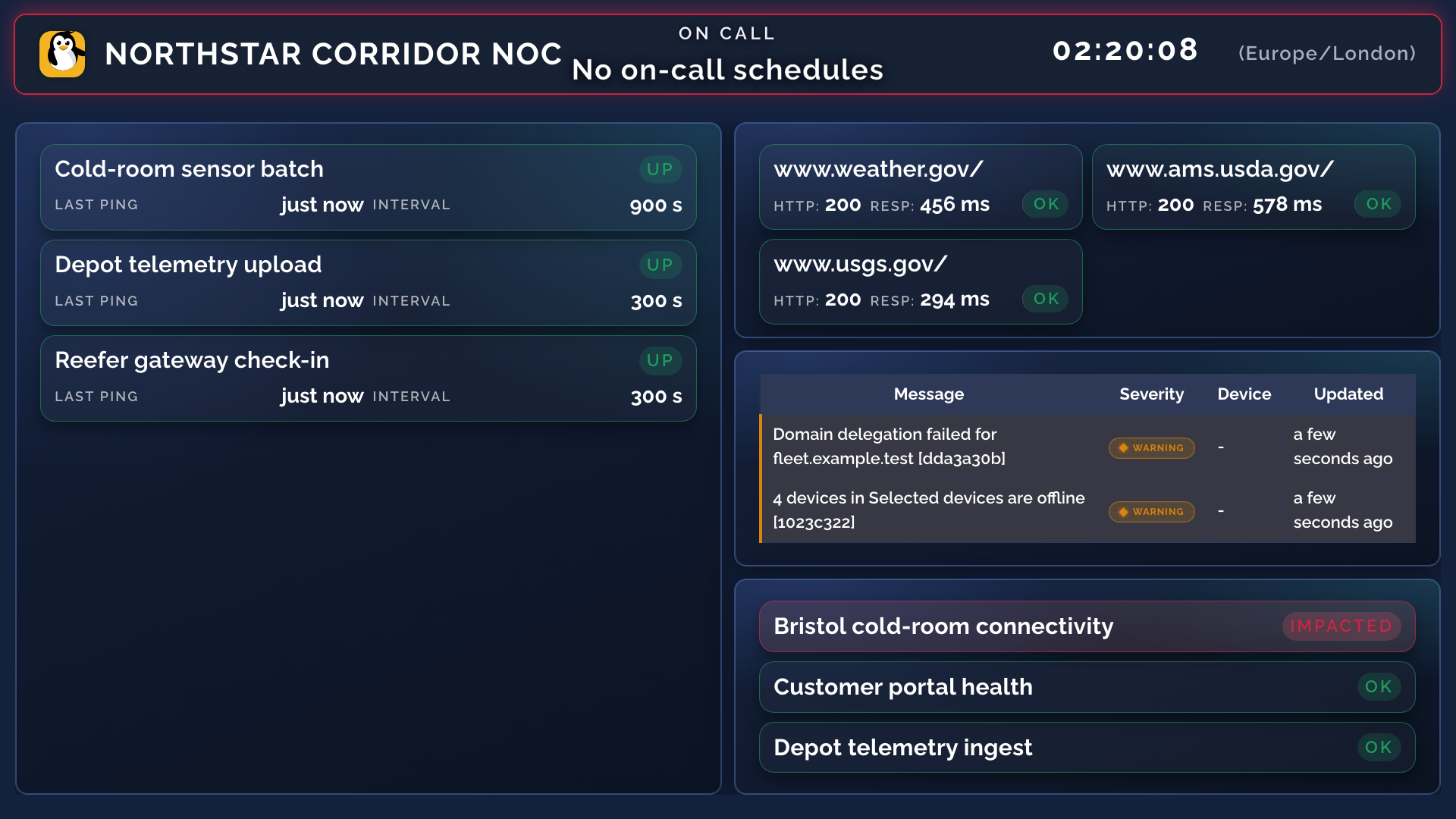
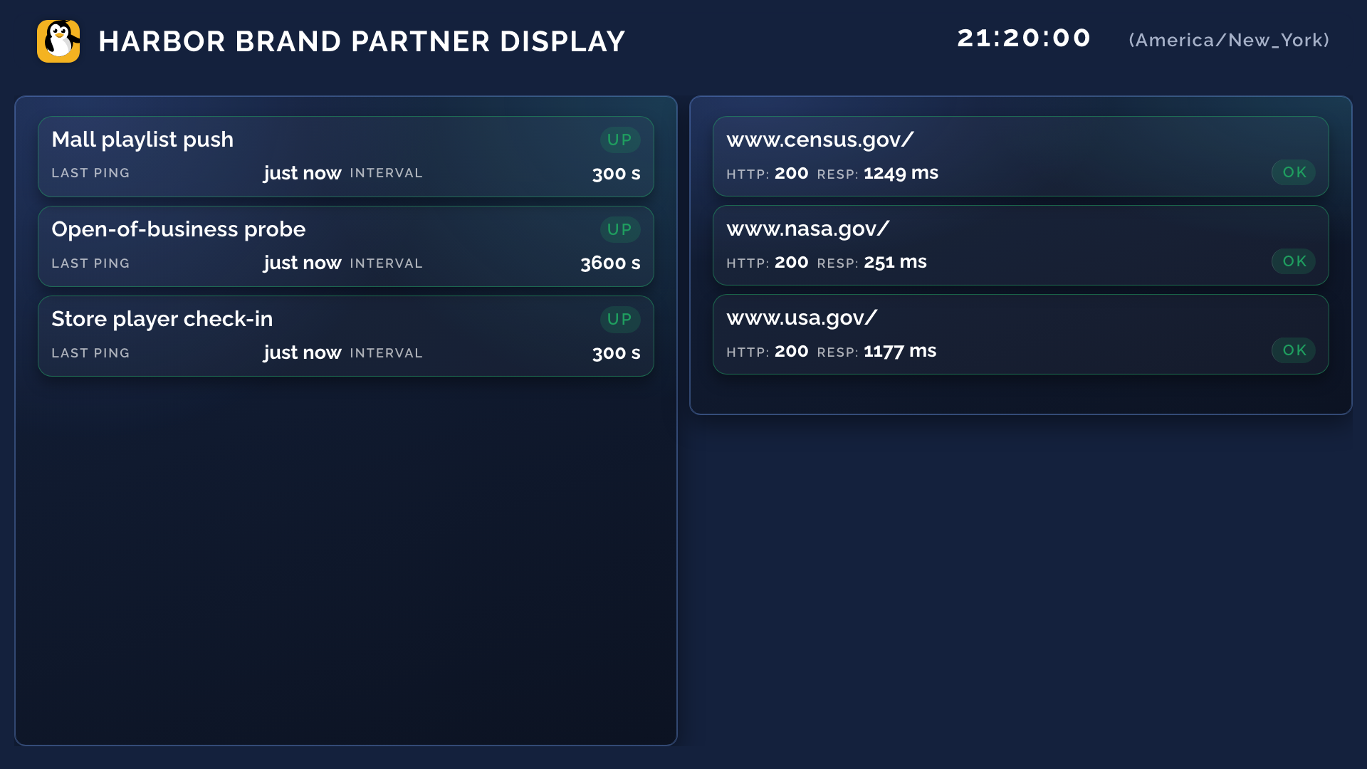
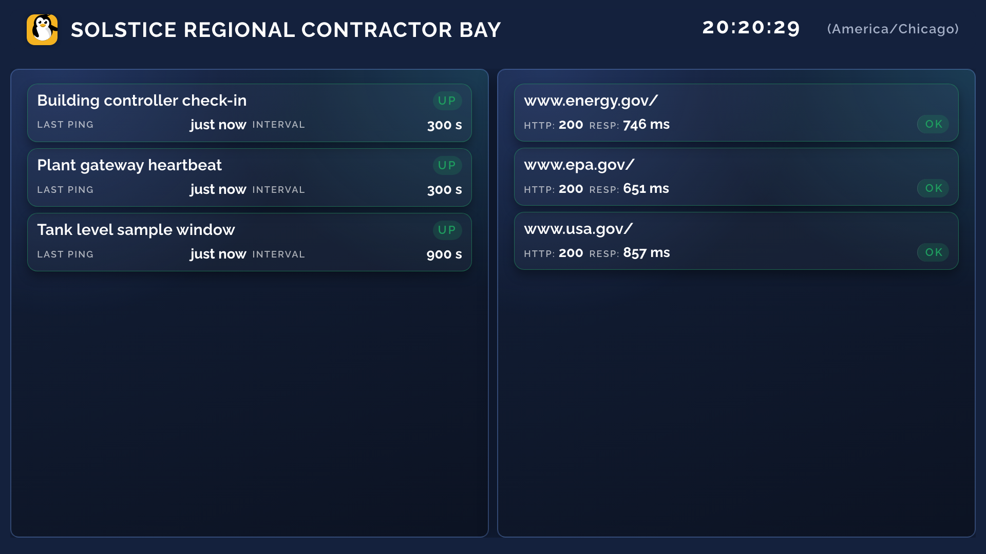
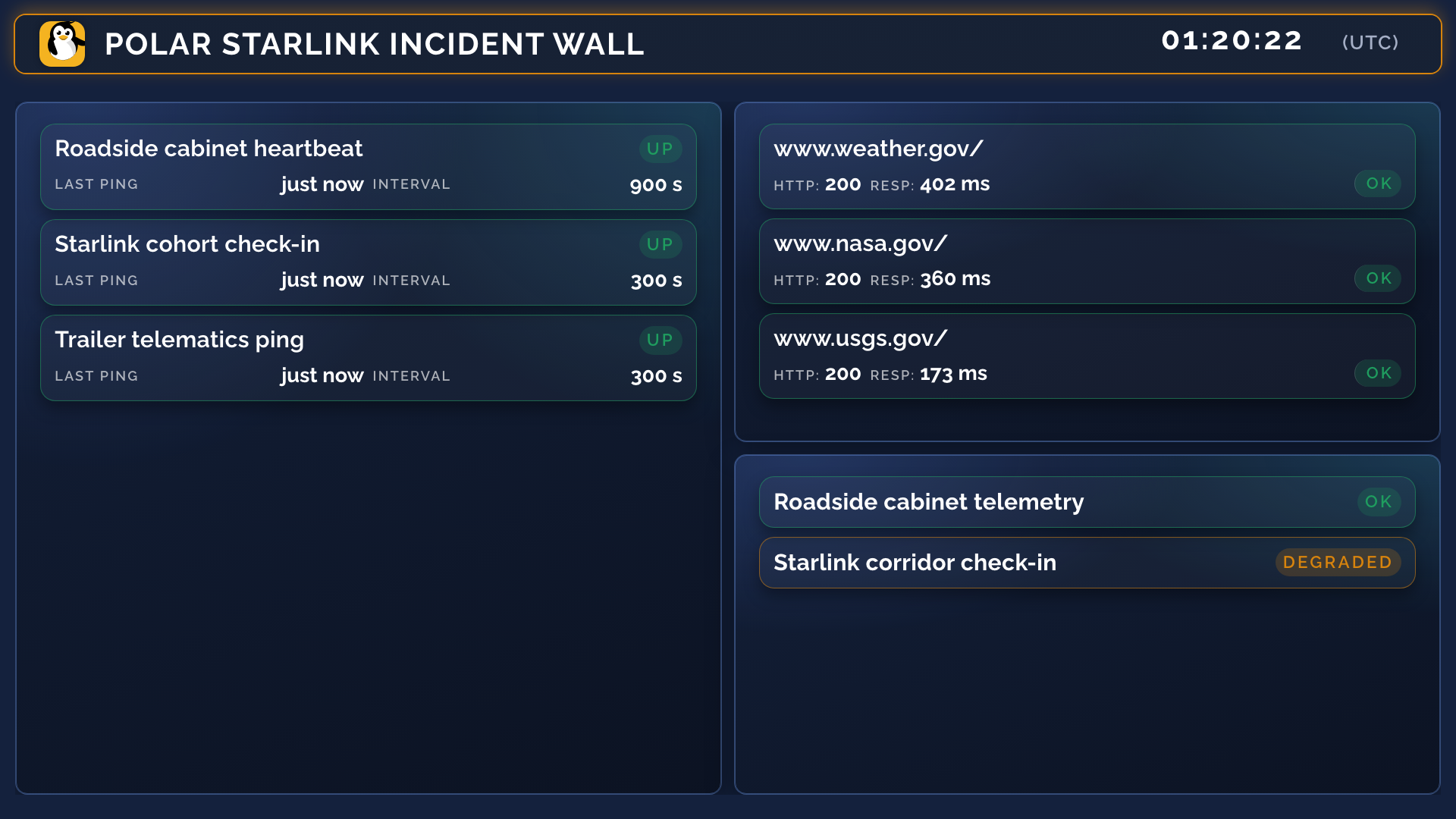
Same product; different editorial choices. Pair each display to one layout.
Outcome #
Each surface earns its place. People trust what they see because it matches their job.